Theme Updates

General chat related to ScummVM, adventure gaming, and so on.

Moderator: ScummVM Team

jimbob0i0
Posts: 31
Joined: Sat Mar 28, 2009 10:03 am

Theme Updates

Post by jimbob0i0 »

Hi all,

Given that the themes on the wiki:

http://wiki.scummvm.org/index.php/GUI_Themes

are well out of date with the changes to the theming system in recent times I've decided to do some replicas (mainly due to my ubuntu system using the new 'New Wave' theme which looks awful with the default modern scumm theme but great with dark).

My initial ones I'll base on the 4 on the wiki (and my thanks to the original authors) for a direction on generating a theme but later ones will be from suggestions, testing the GUI changes in the code, a theme to go with the default ubuntu human etc...

First up is the dark revision I did to suit the look of ubuntu with the new 'New Wave' theme.....

Screenshot:
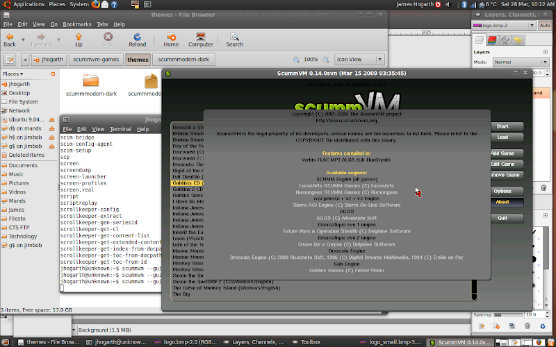
Image

It is a bit rough and ready (for example for initial testing I have just edited the standard modern theme RGB values for the various sections so darkred as an id is actually a dark grey by the rgb value etc... this will be cleaned up in a future release) ... but just posting and uploading to check there is interest in this....

If there is interest I'll clean up the theme code, convert the other themes to the new spec and maintain them going forward with future changes... if not I'll keep to myself ;)

James

http://www.hogarthuk.pwp.blueyonder.co.uk/scummvm/
User avatar
spookypeanut
ScummVM Developer
Posts: 159
Joined: Tue Sep 12, 2006 9:35 am
Location: St Albans, UK
Contact:

Post by spookypeanut »

Nice! Good to get some more choice on the theme front, been getting a bit bored of the default :-) I did spot a slight issue: the logo at the top of the global main menu (ctrl-f5 in-game) still has the orange bits round it, but that's very minor.
Nice job!
jimbob0i0
Posts: 31
Joined: Sat Mar 28, 2009 10:03 am

Post by jimbob0i0 »

Yeah I'd only edited the large logo so far for testing purposes...

The problem with doing the small logo is that the edges of the letters in the bitmap has a threshold change from the colour of the letter to the RGB(255, 0, 255) colour used for the key for the background transparency....

The problem exists in the large logo of course... but given pixel dimensions it is was easier to edit that than the small one to a degree that looks decent....

The two alternatives to 'fixing' this to make it easier in future...

1) Implement a code change in the scumm gui code to be able to use a graphic format that supports transparency without using a colour key (PNG, SVG, etc)... this will need alpha map support.... A bitmap format like PNG would do - a better alternative if possible would be a vector format like SVG so that two logo files wouldn't be needed - just the one that scales...

2) Redo the ScummVM logo in a vector format (like SVG) as a template to then scale appropriately and convert to BMP for packaging.... unless any devs currently have a vector format of the logo to use....

Given my coding expertise option one would take too much time.... even if it has benefits down the road. If someone was to do it as a GSOC project for gui improvement that would rock.... but for now no chance. So that leaves option 2....

When I clean up the STX files to make IDs that make sense (ie darkgrey is grey instead of darkred is grey.... etc) I'll do a option 2 along with it to use as a template for other themes in future as well (quick to change colours etc in it then) and that will resolve the disparity :)

At least I know one person is interested in this :P So at the very least whatever I do for my own benefit I'll upload to my webspace for others to use as they wish.

To any devs who might read this... what license are the images etc under for the Scumm Modern theme? If there is no vector format of the Scumm logo amongst the scumm team if I was to reimplement for others to use would a non-attribution cc license be fine for the project - or would another license be preferred?
fingolfin
Retired
Posts: 1452
Joined: Wed Sep 21, 2005 4:12 pm

Post by fingolfin »

Our logo is already in the SVG format, we only create PNGs from it as needed: http://scummvm.svn.sourceforge.net/view ... m_logo.svg

Built-in support for SVG is not even remotely an option, though. The drawbacks are too many (resource overhead, mostly: Tons of CPU power and RAM usage, and a hefty increase to the size of the executable).
jimbob0i0
Posts: 31
Joined: Sat Mar 28, 2009 10:03 am

Post by jimbob0i0 »

I spent ages looking through the SVN repo for that but only found the svg used for the ico files :/ (i was looking through the scummvm trunk... didn't occur to me to check the repo root for other areas.... not woken up yet lol)

Thank you so much!

That will make it much quicker and easier to do the themes :)

Understandable about the resource overhead... and it's a waste for only the GUI use anyway....

I hope that these will be of use to some people... and that when I finalise a theme they will be of use to the project :)

Any I update I'll try and keep up to date with the latest GUI changes for 0.14 if any edits are required.
jimbob0i0
Posts: 31
Joined: Sat Mar 28, 2009 10:03 am

Post by jimbob0i0 »

A new version of the dark GUI has been uploaded with the logos fixed - thanks kindly to fingolfin for pointing me in the right direction for the SVG logo :)

Next step... cleaning up the STX file to make sense... and then to work on another theme ;)

This is a nice distraction from Simon3D.... just got StS4 but wanted to play through first three before playing it... forgot how annoying Simon3D's controls and camera can be :/

Gah....

Any requests to suite any particular platform's GUI please feel free to throw in my direction :)
User avatar
Longcat
Posts: 1061
Joined: Sat Sep 23, 2006 3:15 pm

Post by Longcat »

good job man! you hve my support if that counts for anything.
10tacle
Posts: 6
Joined: Thu Sep 04, 2014 10:01 am

Post by 10tacle »

Hi there,

Is this the right place to present and share custom themes?

Well I've also created a custom theme for ScummVM.
In my own interest, my goal was to make it match the OS X design.
I believe most of you guys don't use OS X but have a look:
Image
Image
It can be found on DeviantART.

Greetings
User avatar
envisaged0ne
Posts: 162
Joined: Mon Nov 01, 2010 9:17 am
Location: United States

Post by envisaged0ne »

Nice! I think it looks great :D
User avatar
clone2727
Retired
Posts: 1611
Joined: Fri Jun 09, 2006 8:23 pm
Location: NJ, USA

Post by clone2727 »

I was hoping for brushed metal again :(
10tacle
Posts: 6
Joined: Thu Sep 04, 2014 10:01 am

Post by 10tacle »

Are you using OS X Tiger or something? ;)

Well I'm afraid that's not possible since you can't set image files as the window background. You can only set a color gradient (which is white and gray in my theme). Otherwise I would have done you that favor.
Last edited by 10tacle on Sun Sep 07, 2014 9:05 pm, edited 1 time in total.
User avatar
Raziel
ScummVM Porter
Posts: 1541
Joined: Tue Oct 25, 2005 8:27 am
Location: a dying planet
Contact:

Post by Raziel »

10tacle wrote:Are you using OS X Tiger or something? ;)
Well I'm afraid that's not possible since you can't set image files as the window background. You can only set a color gradient (which is white and gray in my theme). Otherwise I would have done you that favor.
1) Go there and ask for it as a new feature (I'd like to have that option too, actually it would be nice to have it as option everywhere, even on buttons) :-)

2) I'm getting warnings when i use your theme, see below
WARNING: PicButtonWidget has size 0x0, but a surface with 18x18 is to be set!
WARNING: PicButtonWidget has size 16x16, but a surface with 18x18 is to be set!
It loads fine though and looks smooth, thanks a lot for it
User avatar
clone2727
Retired
Posts: 1611
Joined: Fri Jun 09, 2006 8:23 pm
Location: NJ, USA

Post by clone2727 »

10tacle wrote:Are you using OS X Tiger or something? ;)

Well I'm afraid that's not possible since you can't set image files as the window background. You can only set a color gradient (which is white and gray in my theme). Otherwise I would have done you that favor.
Nah, I was just making a joke :wink:

(But, I do really dislike the flat/pastel direction Apple and Google Chrome have taken. I miss textures. Also, Mac OS X Tiger. They can drop "Mac" when they allow the OS to run on non-Mac systems. :) )
10tacle
Posts: 6
Joined: Thu Sep 04, 2014 10:01 am

Post by 10tacle »

@Raziel: Good idea, I just posted it there.

Sorry, I didn't notice the warnings. But the reason why I've set PicButtonWidget to 0x0 is that I simply didn't want the button to be right next to the search bar. I was looking for an option to disable it completely, but everytime I deleted the code lines for that button, the entire theme stopped working.
Which means, the button is still existant, but you can neither see it nor click on it (anyway, feel free to re-activate it if you like. Just change the line from 0x0 to 18x18).

@clone: Really? I love the new design. Was waiting for that way too long. Looks sweet, clean and modern. But that's a matter of taste I guess. :)
User avatar
clone2727
Retired
Posts: 1611
Joined: Fri Jun 09, 2006 8:23 pm
Location: NJ, USA

Post by clone2727 »

10tacle wrote:@clone: Really? I love the new design. Was waiting for that way too long. Looks sweet, clean and modern. But that's a matter of taste I guess. :)
It feels barren and cold. I feels like UI design (across all platforms) has taken a step back as of late. If I wanted mostly solid colors for things, I'd go back to Win3.1. I hate minimalism in general.
Post Reply