Hi everybody!
=============== First, a note: English is not my main language so sorry if I have some mistakes in the photos/here. ===============
I just re-installed ScummVM on my iPad 2 and I found some of the keys in the GUI small and uncomfortable. I tried to look at existing themes and such and saw nothing really looked like an iPad / iPhone design. So I decided to make one myself! Since I saw some people on other threades talk about wanting it to be some sort of iBooks, I decided to go with the following design. One thing before we start: I really think this is doable. if the theme options won't enable this, this can be done with an app that will be the interface while SVM will be nested inside it. Here's a video of the GUI if you want to first check if this interests you or not:
Main window - The Games Window ===============================
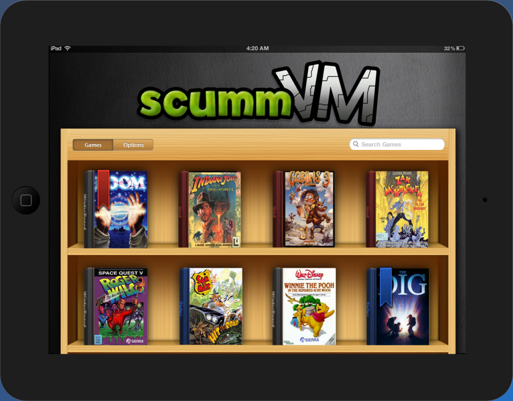
---- All the games are shown here. the bookmark on Loom & the Dig represent games that have saved games. Something like 'you're reading this book' but for a game
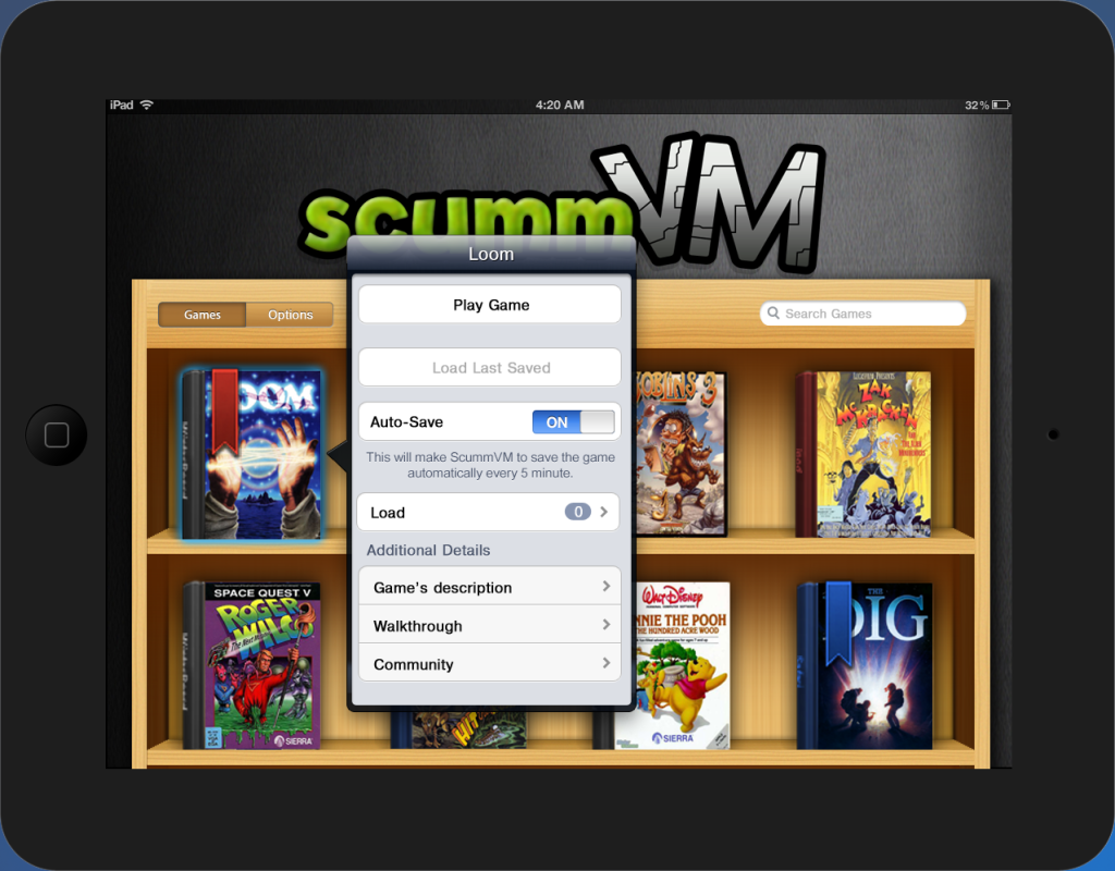 ---- Pressing a game will pop it's menu. The things inside it is pretty much self explanatory. The only thing I think I need to explain might be the Community Button. This button is for ppl who wants hints (without looking in the actual Walkthrough), wants some reviews of the game and such. Thought it would be nice to 'feel' the community (... That sounds a bit awkward... :-/) Well.... le't move to the options!
 Options - General ==================
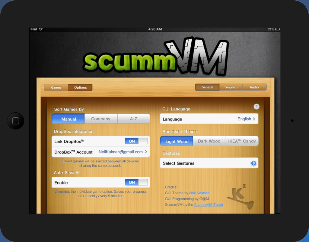 ----
---- Some options here for the new GUI, like the color of the bookshelf, The order the games are placed on the shelf, etc. The DropBox integration is actually something I saw on the forum about iCloud. Saving you're progress to dropbox so you can continue the game on all your devices. The Auto-Save is the same option in the original GUI. It's called Save-All because I added an Auto-Save button for each game. Not sure if this is practical but I thought some ppl would like to auto-save some games and some not.
Options - Graphics ==================
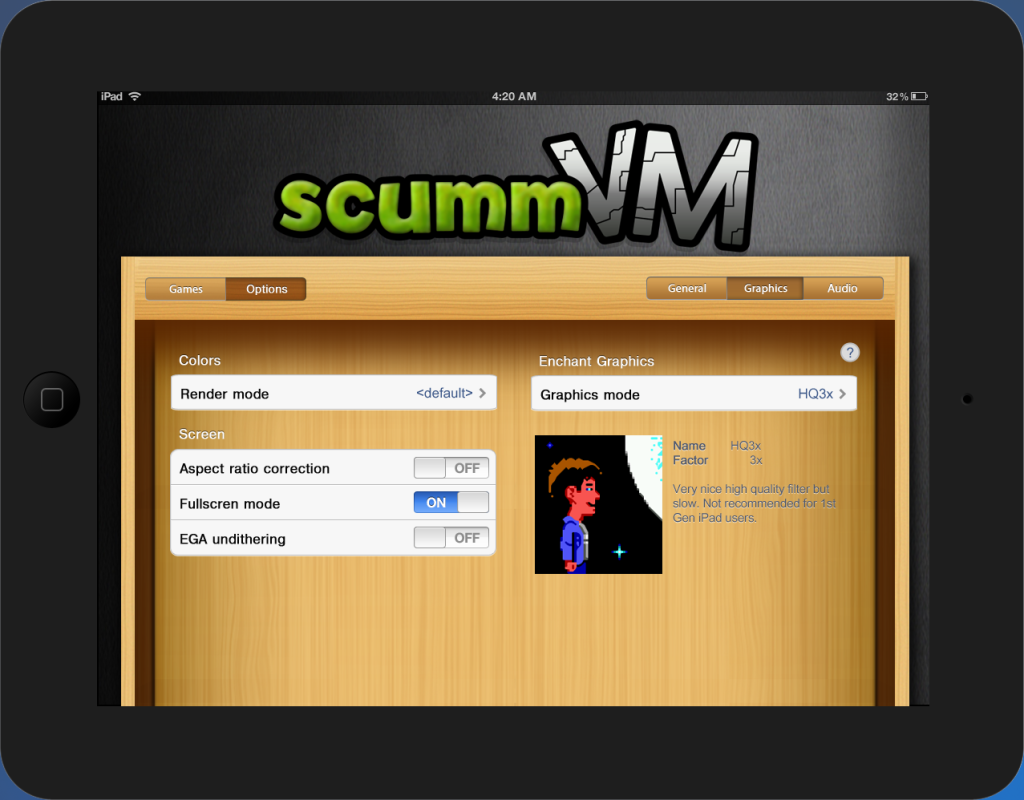 ---- Nothing to explain here. Added the description (with the photo included) of each Graphics Mode. Options - Audio ==================
 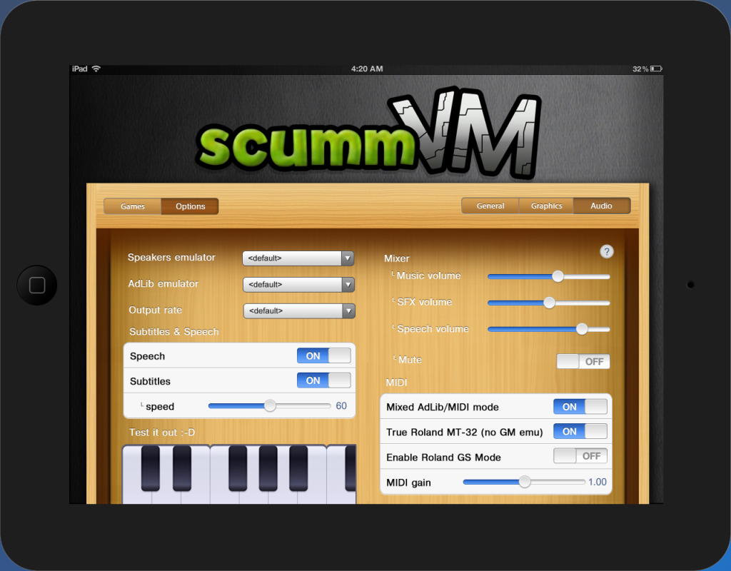 ---- Nothing new here exepts the keyboard
 Anyone thinks he can help me or have any tips for doing this?
Thanks, Neil

