
* nav boxes background change
* fixed thumbnails
http://scummvm.comlu.com/ScummModern-0.05.zip
I have had no time to redo the tabs.
Moderator: ScummVM Team
Code: Select all
29c29
< <td><img src="templates/SVMDesign/images/logo_phpVB2.gif" width="199" height="65" alt="ScummVM logo"></td>
---
> <td width="199"><img src="templates/SVMDesign/images/logo_phpVB2.gif" width="199" height="65" alt="ScummVM logo"></td>
70c70
< <td colspan="4">
---
> <td colspan="4" style="max-width: 750px">Code: Select all
148a149,150
>
> img { max-width: 900px; } /* This will limit how wide an img tag can be so it doesn't spoil the theme. */I actually see no problem on that page, it looks just fine for me in FireFox... Maybe you can describe problem you are seeing, post a screenshot, and tell us which browser it occurs in?billwashere wrote:Sometimes the forum/wiki design breaks if there is too many characters expanding the table. These should fix the forum by limiting the maximum width of an image, make sure the logo in the top left only takes up the size of the image and make sure the width of a table stays inside. This should fix all the problems that occur in pages like http://forums.scummvm.org/viewtopic.php ... c&start=15
Retrieved from "http://wiki.scummvm.org/index.php/Main_Page"
Which version of IE are you referring to? What kind of bug are you experiencing?billwashere wrote:sorry about the long wait, a bit busy over xmas and has finely settled down.
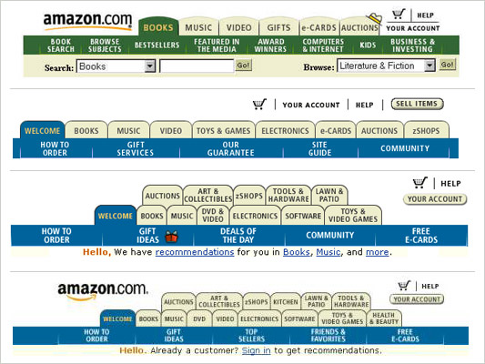
Is a print screen of the tabs
issue:
not working in ie
no border on the left side of the tab

Code: Select all
DIV.tabs A {
	padding-bottom   : 0px;
	padding-top      : 0px;
	text-decoration  : none !important;
	font-size        : x-small !important;
	cursor           : pointer;
}


