PICEDIT 1.3 Milestone 4 released

AGI, SCI, Wintermute, Sludge engines fangame creation discussion

Moderators: ScummVM Team, AGI moderators

Post Reply
lance.ewing
Posts: 57
Joined: Sat Dec 11, 2010 8:11 pm
Location: www.agifans.com
Contact:

PICEDIT 1.3 Milestone 4 released

Post by lance.ewing »

Today I have built and released the fourth milestone of PICEDIT 1.3.

http://picedit.googlecode.com/files/picedit-1.3M4.jar

The new features include:
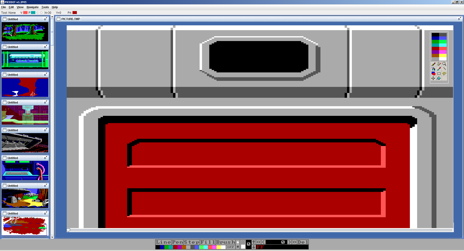
  • * New desktop with internal frame for holding the picture. This is a first step towards enabling multiple pictures in a future milestone release. It also makes it a lot easier to work with zoomed in pictures that extend beyond the edges of the screen.
  • * A slider has been added at the bottom of the picture for quickly changing the picture position. This slider has been built to run as fast as it can.
  • * Fixed a bug where it was difficult to draw a line to the top line of the picture. The line tools (pen, line and step) will now restrict the mouse to within the picture panel so that it isn't possible to leave the picture frame unless the line drawing has been deactivated (with a right click). Thank you to Peter Kelly (author of AGI Studio) for finding and reporting this bug.
  • * Various minor changes to make the tool look more Window like and less DOS like.
Let me know what you all think. I am very keen to hear your feedback and suggestions. This is particularly important this time because I did a large amount of reorganisation of the source code (refactoring for those who know what that means) and I'm not 100% certain myself that I haven't introduced completely new issues. So please have a play around and let me know if it does anything strange.
sact
Posts: 30
Joined: Sat Oct 23, 2010 9:11 pm
Location: 2b||!2b
Contact:

Post by sact »

I meant to write feedback much earlier but been rather busy past few months, thus I'll just skip the superlatives that this project urges me to type and get on the things that matter.

* Zooming from smaller to bigger, does not increase actual drawing windows' size, just adds scrollbars and the window has to be manually stretched bigger. Not good.

* Ok, scrollwheel for zooming sounds more reasonable than ever before but I assume it functionality will be implemented in future. I don't know about scrollwheels much in general but in my mouse, you can click the scrollwheel itself, thus while I do think chance for configuring controlling devices by user himheritself would be really nice, how about letting scrollwheel work both zooming and colour switching, say click on scrollwheel itself to change functionality from one to another?

And here is a sketch I made inspired your plans and the current look of PICEDIT:

Image

I made this after I saw your mentioning multiple pictures, I came up with this vision, something like this? Then I remembered my suggestion to add browsing possibility to folders.. But then came to think, why not being able to browse AGI games' PICDIRs directly as well? Edit pictures within those, and store to them? And while we are at it, optimizing pictures and changing picture's numbers as well.

* You mentioned trying to shift from DOS to Windows-look. In the bottom the old look is still in place but if you look at upperright part, theres floating? palette with graphical tool-icons (with few new tools).

All in all, awesome work.
Last edited by sact on Mon Nov 28, 2011 5:44 pm, edited 3 times in total.
Collector
Posts: 549
Joined: Sun Oct 30, 2005 6:58 pm
Contact:

Post by Collector »

Pallet cycling by mouse wheel would be counter intuitive to anyone used to image editors. What might make more sense would be to handle it with a right click, not the wheel.
lance.ewing
Posts: 57
Joined: Sat Dec 11, 2010 8:11 pm
Location: www.agifans.com
Contact:

Post by lance.ewing »

Good point about the zooming. It has also occurred to me that I need to make the window expand when it zooms in. I've got that on my list of things to do. And I meant to implement mouse wheel zooming in and out but it slipped my mind before releasing 1.3M4. Both features should be in the next release.

Converting the old tool bar to a more modern look is at the top of the list of 1.3M5. Actually I'm part way in to it already. There are many ways I could do it... lots of places I could put the tool bar. Floating is a good idea. I'll try that as well and see what option seems the best. I've got a feeling that I'll spend most of this milestone trying to prototype different options on how to implement the new toolbar.

What you've shown for multiple pictures is one of the ideas I had for how to implement it. It can either show a directory that happens to contain a whole lot of AGI picture files or it could be the PICEDIT. I'm not sure if I'll get on to multiple pictures for this milestone though. You may have noticed that I'm trying to release a new milestone every month, usually around 13th/14th of the month. So it depends how much free time I get to work on it.
lance.ewing
Posts: 57
Joined: Sat Dec 11, 2010 8:11 pm
Location: www.agifans.com
Contact:

Post by lance.ewing »

Collector wrote:Pallet cycling by mouse wheel would be counter intuitive to anyone used to image editors. What might make more sense would be to handle it with a right click, not the wheel.
It is hard to know which way to go. Right clicking is a good idea. Maybe right clicking could bring up the whole tool bar, not just the colours. But having said that, I was thinking that right clicking could bring up an additional menu of some kind (not yet sure what would go in there though... maybe right click on a line and select delete or add vertice or something).
sact
Posts: 30
Joined: Sat Oct 23, 2010 9:11 pm
Location: 2b||!2b
Contact:

Post by sact »

Collector wrote:Pallet cycling by mouse wheel would be counter intuitive to anyone used to image editors. What might make more sense would be to handle it with a right click, not the wheel.
sact wrote:...I do think chance for configuring controlling devices by user himheritself would be really nice...
I've suggested that from the very beginning and I still think that would be the best way. Everybody has their own way of doing things.

Truth is, I haven't either ever used image editor with possibility to change colour with scrollwheel, but in AGI's case, with it's limited palette, at least an option to try out might be interesting, say leave right mouse button for tool changing? So many possibilities!
Collector
Posts: 549
Joined: Sun Oct 30, 2005 6:58 pm
Contact:

Post by Collector »

lance.ewing wrote:There are many ways I could do it... lots of places I could put the tool bar. Floating is a good idea.
Often a floating pallet or toolbar just gets in the way, even though it can be handy in some circumstances. I have found the best option is to have the toolbars/pallets be dockable. You can tear them off to become floaters, but can be docked on the edges when you want to get them out of your way. This is especially good when you have child windows within the main body of the app. When docked, the toolbars/pallets never cover up the working window, at least when maximized.

One possibility for the context menu would be to have the pallet open under the cursor on a right click and go away when the cursor is moved off of it.
lance.ewing
Posts: 57
Joined: Sat Dec 11, 2010 8:11 pm
Location: www.agifans.com
Contact:

Post by lance.ewing »

Yeah, maybe dockable is the way to go. Actually I was playing around with something last night where the toolbar in Java can be set as floatable. What that means is that it is initially "docked" I guess you'd call it but can be dragged out to become floating if required. Maybe that is the best way to go on it then.

One prototype I was working on had the tool bar within the internal frame but I didn't like that. With that approach every picture loaded in multi picture mode would end up with its own toolbar within the picture frame, which to me seemed to clutter things too much. I think I should keep the internal picture frame as basic as possible.... otherwise what is the point of having a desktop with internal windows. The internal windows would end up becoming almost standalone, which I think defeats the purpose.
lance.ewing
Posts: 57
Joined: Sat Dec 11, 2010 8:11 pm
Location: www.agifans.com
Contact:

Post by lance.ewing »

After playing around with the new tool bar a bit, and thinking ahead to multiple picture editing, I think that the tool bar itself has to be outside the internal frame. It will be floatable and dockable. It will initially be docked and then can be floated if required. When it is floating it can then be docked in one of the four sides of the blue desktop. So you could put it at the top, bottom, left hand side or right hand side, whatever you prefer. I might even be able to get the docked or floating position saved as preference... if not for this milestone then for a future one.

One thing that I think is probably going to have to move inside the internal frame is the status bar. A lot of what is in the status bar will disappear as a result of moving to a more standard windows style tool bar. For example, the tool bar is going to show what tool is selected and also what visual and priority colours are selected. So that whole first part of the status bar will disappear. All this leaves is the mouse position and the priority band value. I still need to show those somewhere. So somewhere inside the internal frame seems to make sense.
Collector
Posts: 549
Joined: Sun Oct 30, 2005 6:58 pm
Contact:

Post by Collector »

That is the way that dockable tool bars usually function.
Post Reply